Editorial Serif Anchor

Forever + Majestic Letters
Anchors Forever's fluid strokes with crisp Roman proportions on wedding suites, headers and packaging.
Inspect Majestic Letters specimenDisclosure: MakerFileHub may earn a commission from qualifying purchases via paid links on this page. How our links work.
Rhinestone-oriented script built from even strokes sized for stone placement
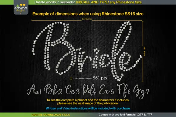
Forever is a rhinestone-oriented script in which the strokes are drawn as even channels wide enough to hold a line of stones, and the sample shows a size chart for the finished piece.
Paid link
Get this fontProject & layout blueprintsAt-a-glance maker compatibility
Weld or Unite overlapping script joins into one continuous vector path before sending to the blade.
Visual anatomy & craft review
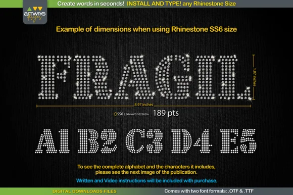
Every letter is built from a stroke of constant width rather than a calligraphic swell, because a rhinestone design needs a channel that can hold one row of stones at a fixed gauge. The F opens with a looped stem, the o and the r close round shapes, the e loops back through its bowl and the v keeps two even diagonals, all at the same thickness so the stone spacing stays consistent across the word. The sample measures the finished phrase in inches and gives the stone size and point count, which is how a maker works out transfer film and stone quantity before cutting anything. Counters are open and the letters are separated enough that a stone line does not merge. The dark glitter ground, the dimension markers and the small note blocks are presentation; the script is the word and the alphabet shown below it.
Rhinestone · Even · Sized
Two-font hierarchy recipes
Tested contrast partners — pairing Forever with grounded secondary typography.
Forever + Majestic Letters
Anchors Forever's fluid strokes with crisp Roman proportions on wedding suites, headers and packaging.
Inspect Majestic Letters specimen
Forever + Swaraga
Keeps small-scale dates, URLs, nutrition facts and care instructions crisp and legible below script titles.
Inspect Swaraga specimenPractical applications
Concrete hierarchy, scale and production guidance tailored to Forever’s stroke geometry.
The even stroke holds a single row of stones along the whole word, and the looped cuts mean the sash lettering can be produced as one transfer piece.
Hierarchy & layout recipe
Set the word at 3 in wide on a waist sash, keep the stone channel at one gauge throughout, and leave 1 in of clear satin at each end so the ends of the transfer do not lift.
Pre-production check
Heat-pressing a long transfer on satin can scorch the ends; test one scrap at the same temperature and shorten the dwell time before pressing the sash.
The script reads as a decorative header on a tutorial page, and the even channel explains the technique in the type itself before the steps begin.
Hierarchy & layout recipe
Set the header at 54 pt on an A4 tutorial page, keep the step text in a 10 pt sans at 14 pt leading, and hold 14 mm between the header and the first step line.
Pre-production check
A rhinestone-style script at small sizes reads as a plain outline; check the proof and keep the header large enough to show the channel.
The even channel suits a made-to-order piece on card or fabric, and the open counters let the word read from across a room even when the stones are light.
Hierarchy & layout recipe
Set the word at 6 in wide on a 12 in card cake board, keep at least 1 in of clear board at each end, and confirm the stone count against the supplier's pack size before ordering.
Pre-production check
A channel narrower than the stone gauge will not hold the row; check the stone diameter against the drawn stroke before the transfer is cut.
Technical & licence verification
Confirm included OTF/TTF/WOFF formats, full glyph tables and licence coverage on the live store page before batch production.
Closest visual alternatives
Matched across letterform anatomy, stroke behaviour and craft applications.
Looped script with flourishes
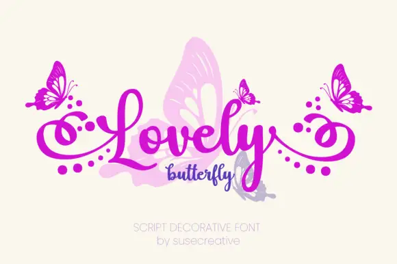
Lovely Butterfly is a looped connected script in magenta on cream: a large word with tall loops and long dotted side flourishes, a smaller script word beneath, butterfly illustrations at both ends and a pale butterfly silhouette behind the letters, with two plain lines at the foot.
Fine wavering curled script with spiral terminals on the capitals
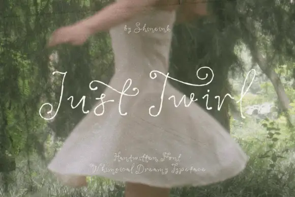
Just Twirl is a fine handwritten script in which the stroke wavers slightly along its length, the capitals curl into open spirals and the ends of the letters turn back on themselves.
Ideas for this font
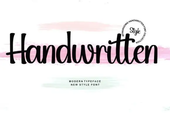
Upright compact script with flared terminals and closed tight fit
Handwritten is a compact upright script in which the letters stay close together, the strokes run heavy and even, and the terminals flare slightly where the pen lifts.
Ideas for this font
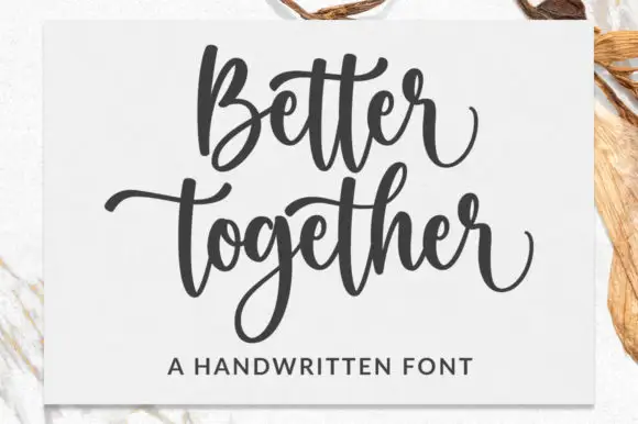
Broad bouncing script with paired cross strokes and a deep descender loop
Better Together is a broad bouncing script in which the words rise and fall, the paired t cross strokes reach across neighbours and the g drops a deep loop, so a stacked phrase reads as a warm handwritten statement.
Ideas for this font
Same independent foundry
Allow optional Google Analytics to measure visits and catalogue actions. Your search words and notes are not included. Privacy & storage