High-Contrast Display Serif

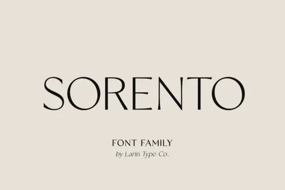
Christmas Story + Vanielst Elegant Serif Display Stylistic
Pairs sculptural editorial warmth with Christmas Story's clean modern geometry.
Inspect Vanielst Elegant Serif Display Stylistic specimenDisclosure: MakerFileHub may earn a commission from qualifying purchases via paid links on this page. How our links work.
Christmas collection pairing a brush script with an ornate swash serif
Christmas Story is a two-cut collection in which a brush script sets one word and an ornate serif with a spiral swash sets the other, so a greeting gets a handwritten line and an engraved line from one purchase.
Paid link
Get this fontProject & layout blueprintsAt-a-glance maker compatibility
Weld or Unite overlapping script joins into one continuous vector path before sending to the blade.
Visual anatomy & craft review
The script draws a capital C with a tall loop, a light i dot, a round s and a hooked t, all in a brush contrast; the serif cut builds a bone-weight S that spirals inward, slab-ish stems and a straight R leg. The pairing is the character: the loose script answers the stiff serif, which is why the sample stacks them and lets the S swash run down the left edge. The script holds at 28 pt and the serif at 40 pt, so the two cuts are used at different sizes rather than on one line. The pale winter photograph, the red frame, the small ornament and the line beneath are presentation; the two display words are the collection.
Collection · Brush · Ornate
Two-font hierarchy recipes
Tested contrast partners — pairing Christmas Story with grounded secondary typography.
Christmas Story + Vanielst Elegant Serif Display Stylistic
Pairs sculptural editorial warmth with Christmas Story's clean modern geometry.
Inspect Vanielst Elegant Serif Display Stylistic specimen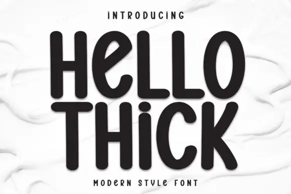
Christmas Story + Hello Thick
Introduces organic movement on pull-quotes, signatures and gift tags.
Inspect Hello Thick specimenPractical applications
Concrete hierarchy, scale and production guidance tailored to Christmas Story’s stroke geometry.
The two cuts give a printed card a hierarchy without a third font, and the serif swash holds its spiral at 40 pt on smooth card.
Hierarchy & layout recipe
Print a 120 by 170 mm card: set the script word at 28 pt, set the serif word at 40 pt beneath it, and keep 18 mm of margin at the left so the spiral S is not trimmed by the fold.
Pre-production check
A spiral swash needs room outside its own letter; check the printed card and pull the block right rather than shrinking the S.
The collection covers both a handmade and a formal line, and the brush cut still reads on a 70 mm box label at 20 pt in one ink.
Hierarchy & layout recipe
Print a 70 by 50 mm label: set the shop name at 20 pt in the script, set the product word at 26 pt in the serif beneath, and keep 6 mm from the die so the swash tail is inside the cut.
Pre-production check
A swash printed across a die edge gets cut in half; check the label die and move the serif word to the centre.
The engraved serif carries the course names while the script signs the top, so one insert reads as a printed menu rather than a flyer.
Hierarchy & layout recipe
Print a 105 by 210 mm insert: set the restaurant name at 28 pt in the script at the head, set the courses at 24 pt in the serif with 10 mm between them, and keep the swash clear of the first course line.
Pre-production check
A spiral S run into a course name looks like a collision; check the proof and add 6 mm of air under the head.
Technical & licence verification
Confirm included OTF/TTF/WOFF formats, full glyph tables and licence coverage on the live store page before batch production.
Closest visual alternatives
Matched across letterform anatomy, stroke behaviour and craft applications.
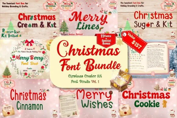
Eleven-cut holiday set of scripts, bubble faces and serif duos
Christmas Font Bundle is an eleven-cut seasonal set in which chunky retro bubble letters, tall condensed print, looping brush scripts and serif pairs sit side by side, so one purchase covers a card, a sign and a tag in the same holiday tone.
Ideas for this font
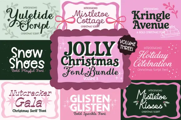
Christmas assortment spanning scripts and bold display forms
Jolly Christmas Bundle Vol3 shows nine separate panels around a central title, from Yuletide Script and Mistletoe Cottage through Kringle Avenue, Snow Shoes, Holiday Celebration, Nutcracker Gala and Glisten Glisten to Mistletoe Kisses, where each panel names its own style from Christmas script to bold sparkle lettering.
Ideas for this font
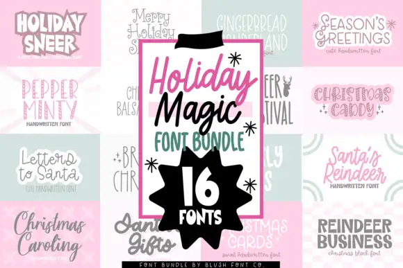
Mixed Christmas font bundle
Holiday Magic Christmas Bundle shows narrow print, loose script and heavier display samples arranged around a central bundle label, with differently weighted Christmas headings in a single collage rather than one consistent voice.
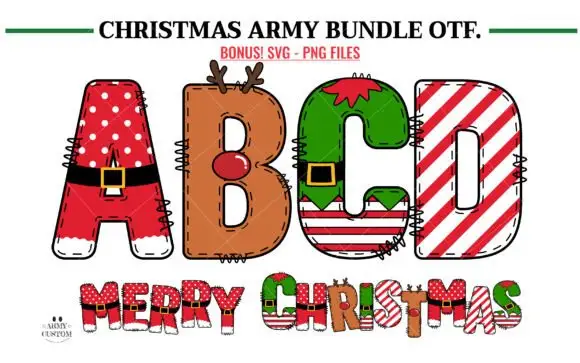
Broad Christmas blocks mixing Santa suits, reindeer and candy stripes
Christmas Army Bundle shows four letters in four festive treatments: a red A with white dots, a black belt and white trim, a brown B carrying antlers and a red nose, a green C shaped like an elf suit and a D built from candy stripes, each costume applied to a broad block body.
Ideas for this font
Same independent foundry
Allow optional Google Analytics to measure visits and catalogue actions. Your search words and notes are not included. Privacy & storage