Editorial Serif Anchor

Brethany + Auretha
Anchors Brethany's fluid strokes with crisp Roman proportions on wedding suites, headers and packaging.
Inspect Auretha specimenDisclosure: MakerFileHub may earn a commission from qualifying purchases via paid links on this page. How our links work.
Wide fine romantic script with a long closing tail
Brethany is a wide, fine-lined romantic script that opens with a tall looped capital and closes by releasing the last letter into a long tail that sweeps under the whole word.
Paid link
Get this fontProject & layout blueprintsAt-a-glance maker compatibility
Weld or Unite overlapping script joins into one continuous vector path before sending to the blade.
Visual anatomy & craft review
The capital B stands nearly twice the height of the lowercase, its two chambers drawn as thin open loops, and the r, e, t, h and a that follow are set wide with large apertures, which is what makes the word feel open rather than crowded. Weight is a fine consistent line that thickens slightly where the stroke meets the baseline, and every join sits high, giving the letters a slight upward pull. The final y becomes the signature device: its descender turns and runs back left as a long flat tail beneath the entire word, so the lockup ends up wider than the lettering itself. The small tracked spec note beside the B, the caption block beneath and the blush diagonal on the ground are presentation, not alphabet.
Wide · Tender · Flowing
Two-font hierarchy recipes
Tested contrast partners — pairing Brethany with grounded secondary typography.
Brethany + Auretha
Anchors Brethany's fluid strokes with crisp Roman proportions on wedding suites, headers and packaging.
Inspect Auretha specimen
Brethany + Godthem
Keeps small-scale dates, URLs, nutrition facts and care instructions crisp and legible below script titles.
Inspect Godthem specimenPractical applications
Concrete hierarchy, scale and production guidance tailored to Brethany’s stroke geometry.
The sweeping closing tail gives a small card a bottom edge that holds the eye, which lets an invitation stay minimal and still feel finished without a border or an illustration.
Hierarchy & layout recipe
Set the names at 30 pt on a 5 by 7 inch card, plan the tail so it stops 10 mm short of the trim, and keep the details block above it rather than below, where it would have to fight the sweep.
Pre-production check
If the tail is trimmed by the die the whole device fails; mark the safe area on the artwork before the printer imposes the card.
Wide fine lettering fills a narrow label without a second line, and the romantic tone suits a product whose main claim is that it was made slowly and by hand.
Hierarchy & layout recipe
Keep the name at 13 pt on a 55 mm label, set the volume and ingredients in a plain sans at 6 pt at the foot, and hold the tail inside the label so it never crosses the seam of the bottle.
Pre-production check
Fine hairlines on a matte laminate can fill in with adhesive; ask for a proof on the finished label rather than a flat sheet.
A wide script with a long exit sets a magazine opener apart from the column that follows, and the tail provides a natural rule under the headline without drawing one.
Hierarchy & layout recipe
Run the title at 46 pt on the first spread, let the tail align to the text measure so it reads as a deliberate rule, and set the standfirst at 10 pt starting two lines below the lowest loop.
Pre-production check
Check the tail against the column width on the second proof: if it falls short it reads as a mistake rather than as a device.
Technical & licence verification
Confirm included OTF/TTF/WOFF formats, full glyph tables and licence coverage on the live store page before batch production.
Closest visual alternatives
Matched across letterform anatomy, stroke behaviour and craft applications.
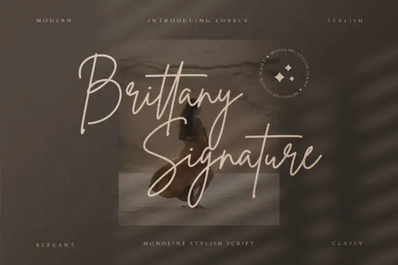
Monoline signature script with tall slender loops
Brittany Signature is a monoline signature script in which the capitals rise into slender loops, the body stays narrow and the joins stay even, so a name reads as a quick signature made with a fine marker.
Ideas for this font
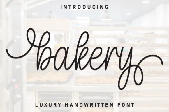
Fine looped signature script with broad entry and exit curls
Bakery is a fine looped script in which the joins stay light, the ascenders draw narrow upper loops and the last descender turns into a broad curl that travels under the word, so a name reads as a written signature.
Ideas for this font
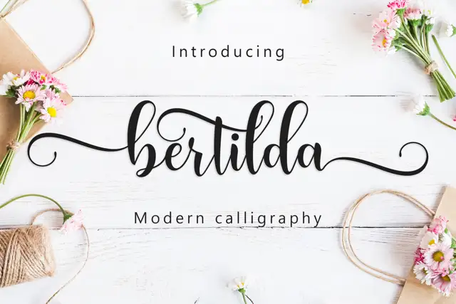
Broad swashed lowercase calligraphy
Bertilda Script is a broad lowercase calligraphy whose entry and exit swashes travel further than the letters themselves, so a seven-letter word occupies the width of a full line.
Ideas for this font
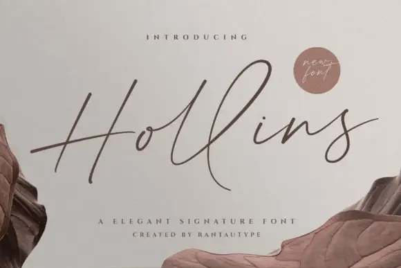
Tall fine signature script with delicate swashes
Hollins is a slender signature script that stretches its ascenders well above the x-height and holds every join at hairline weight, with swashes that leave the word instead of decorating it.
Ideas for this font
Allow optional Google Analytics to measure visits and catalogue actions. Your search words and notes are not included. Privacy & storage