Editorial Serif Anchor

Alive + Grandeur – Elegant Classic Serif
Anchors Alive's fluid strokes with crisp Roman proportions on wedding suites, headers and packaging.
Inspect Grandeur – Elegant Classic Serif specimenDisclosure: MakerFileHub may earn a commission from qualifying purchases via paid links on this page. How our links work.
Looped initial script with a giant oval capital over compact lowercase
Alive is a looped script in which one oversized oval capital leads a compact lowercase row, the ascenders draw narrow loops and the i carries a heart-shaped dot, so a single name becomes a mark.
Paid link
Get this fontProject & layout blueprintsAt-a-glance maker compatibility
Weld or Unite overlapping script joins into one continuous vector path before sending to the blade.
Visual anatomy & craft review
The A rises as an open oval larger than the rest of the word, the l lifts a thin loop, the i sits under a heart dot, and the connecting strokes run heavy and close so the lowercase reads as one continuous body under the tall initial. The scale jump is the character: the initial carries the weight while the body stays small, which is why the sample sets a single first name and nothing else. Because the joins overlap, the face must be welded before cutting and needs 1.1 inches of x-height in vinyl; it also ships ligatures that change the fit of common pairs. The pale ground, the faint botanical sketch and the caption beneath are presentation; the dark name is the face.
Looped · Initial-led · Heart dot
Two-font hierarchy recipes
Tested contrast partners — pairing Alive with grounded secondary typography.
Alive + Grandeur – Elegant Classic Serif
Anchors Alive's fluid strokes with crisp Roman proportions on wedding suites, headers and packaging.
Inspect Grandeur – Elegant Classic Serif specimen
Alive + Bareum
Keeps small-scale dates, URLs, nutrition facts and care instructions crisp and legible below script titles.
Inspect Bareum specimenPractical applications
Concrete hierarchy, scale and production guidance tailored to Alive’s stroke geometry.
The heart dot makes the affectionate reading explicit, and the heavy body keeps the phrase legible at 30 pt across a small card.
Hierarchy & layout recipe
Print an A6 card: set the phrase at 30 pt across the middle, keep the heart dot clear of every rule by 6 mm, and leave the lower half blank so a written message has room to run.
Pre-production check
A heart dot printed on top of a decorative line loses its shape; check the card and keep 6 mm of clear ground around the dot.
The oversized initial gives a first name presence on a small card, and the compact body stays readable at 24 pt at table distance.
Hierarchy & layout recipe
Print a 90 by 50 mm tent card: set the name at 24 pt centred, keep 10 mm either side so the looping capital has air, and fold 20 mm from the top so the score clears every descender.
Pre-production check
A score line run through a loop splits the printed stock; check the imposed card and keep the fold 8 mm below the lowest stroke.
The initial-led word turns a short brand name into a mark, and the even body holds at 26 pt on a 60 mm round label without the capital swallowing the rest of the word.
Hierarchy & layout recipe
Print a 60 mm round label: set the name at 26 pt, keep 6 mm inside the die so the capital oval stays whole, and set the scent and weight in a 7 pt sans beneath the baseline.
Pre-production check
A large initial printed off-centre looks like a misprint; check the label and centre on the widest part of the word.
Technical & licence verification
Confirm included OTF/TTF/WOFF formats, full glyph tables and licence coverage on the live store page before batch production.
Closest visual alternatives
Matched across letterform anatomy, stroke behaviour and craft applications.
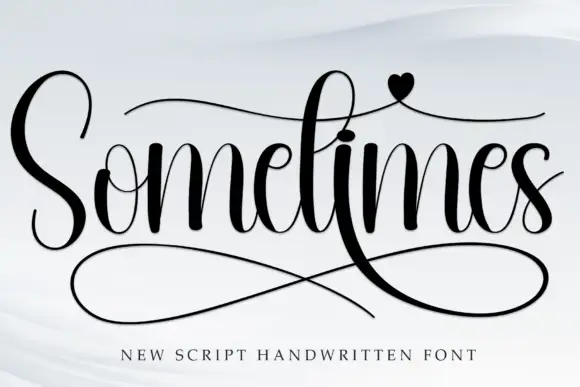
High-contrast handwritten script with long swashes
Sometimes is a high-contrast handwritten script in black on white: thick downstrokes against hairlines, a very tall S, crossbar strokes that run the length of the word, a heart on the i and a huge double loop sweeping under the letters.
Ideas for this font
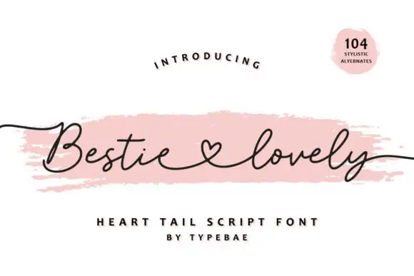
Heart-tail script with a light even stroke and a joined heart connector
Bestie Lovely is a light even script whose two words are joined by a small open heart drawn into the pen line, with long flat tails that leave the phrase on both sides.
Ideas for this font
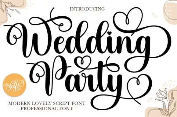
Ornamental modern script with heart flourishes
Wedding Party is an ornamental script in black on cream: heavy stems with hairline joins, capitals that throw loops over the whole line, and drawn hearts worked into the flourishes above and below the words.
Ideas for this font
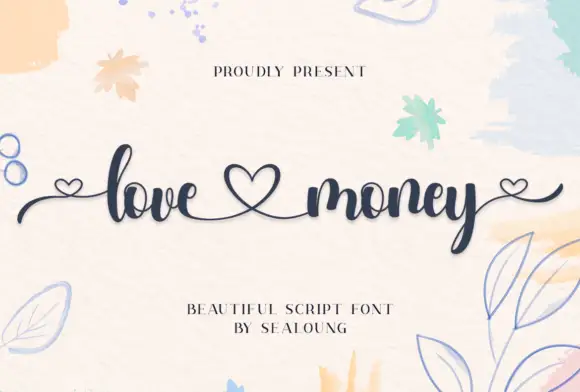
Heart-linked high-contrast script
Love Money is a fine script in navy on a watercolour ground: high-contrast strokes, looping ascenders, and hearts drawn into the line so that the two words are joined and closed by them.
Ideas for this font
Same independent foundry
Allow optional Google Analytics to measure visits and catalogue actions. Your search words and notes are not included. Privacy & storage