Modern Grotesque Body

Vernacular Serif + Olline
Creates crisp high-hierarchy contrast beneath Vernacular Serif headlines across menus, websites and labels.
Inspect Olline specimenDisclosure: MakerFileHub may earn a commission from qualifying purchases via paid links on this page. How our links work.
Broad contrasting serif trilogy
Vernacular Serif is a broad contrasting serif in black on off-white: wide caps with fine joins and a flat waist, set as one word above a row that names three companion cuts — sans, serif and Clarendon — with a second line beneath in a lighter weight and a small rule at the foot.
Paid link
Get this fontProject & layout blueprintsAt-a-glance maker compatibility
Sturdy stroke walls and open counters weed cleanly on adhesive vinyl, HTV apparel film, and cut cardstock.
Visual anatomy & craft review
The plate is a reference sheet rather than a single specimen, and it is organised usefully: the roman name sits at display size, and beneath it the three companion groups are named with rules between them, so a buyer can see the system at a glance. The drawing is a broad serif with fine joins and a flat waist, and the row beneath switches between a grotesque, a serif and a slab in the same size, which is the comparison the family is built for. The plate also states the number of styles and the small caps availability, which is the detail a book designer needs. Because the contrast is high but not extreme, the face works at text and display sizes, and the plate shows both in one view.
Serif, editorial, versatile, classic
Two-font hierarchy recipes
Tested contrast partners — pairing Vernacular Serif with grounded secondary typography.
Vernacular Serif + Olline
Creates crisp high-hierarchy contrast beneath Vernacular Serif headlines across menus, websites and labels.
Inspect Olline specimen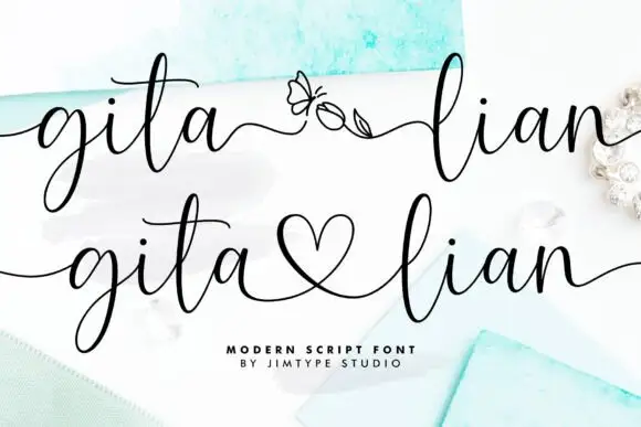
Vernacular Serif + Gita Lian
Adds a warm human signature touch for 1-to-3-word callouts without competing against structured serif capitals.
Inspect Gita Lian specimenPractical applications
Concrete hierarchy, scale and production guidance tailored to Vernacular Serif’s stroke geometry.
A trilogy gives a magazine a headline, a caption and a data voice that belong together, which is what keeps a monthly coherent across sections.
Hierarchy & layout recipe
Set the feature title at 70 mm in the serif, the captions at 8 pt in the sans, and the data labels at 7.5 pt in the Clarendon. Print two colours across the section on a coated stock.
Pre-production check
Check the 7.5 pt data labels in the slab, where tight counters can fill; open the tracking. Confirm the 8 pt captions read at arm's length and that the three cuts stay distinct.
A family with three voices lets a publisher brand a series and its colophon from one licence, which matters when a list runs to dozens of titles.
Hierarchy & layout recipe
Set the imprint at 18 pt in the serif on a card, 80 mm on a spine in the sans, and 9 pt in the slab for a series line. Keep one colour and hold clear space equal to the cap height.
Pre-production check
Check the 9 pt series line on uncoated stock, where slab joins can fill; keep them above 0.2 mm. Confirm the spine reads at arm's length and that the three cuts stay recognisable.
A trilogy covers the invitation, the menu and the place cards without mixing families, which is what a large wedding actually needs.
Hierarchy & layout recipe
A5 invitation: the names at 26 pt in the serif, the request at 9.5 pt in the same cut, and the place names at 11 pt in the sans. Keep 22 mm margins and print one ink on cream.
Pre-production check
Check the 11 pt place names in the sans on uncoated card, where fine joins can fill; keep the size above 10 pt. Confirm the names read at arm's length and that the suite stays consistent.
Technical & licence verification
Confirm included OTF/TTF/WOFF formats, full glyph tables and licence coverage on the live store page before batch production.
Closest visual alternatives
Matched across letterform anatomy, stroke behaviour and craft applications.

Modern combination serif with italic
Things is a modern serif in blue on white: moderate-high contrast, a wide f with an overhanging arm, a g whose descender loops fully closed, and tall ascenders, presented with a note that the family includes an italic and a paragraph of small text.
Ideas for this font

Luxury editorial serif with script
Medvilea Editorial is a luxury editorial serif in near-black on white: high contrast, long flat serifs and a wide bowl, paired with a swashed script that loops above and below the line, with small tracked notes in all four corners and a centred caption beneath.
Ideas for this font

Fine serif title with large upper and lower loops
Amilea shows pale yellow high-contrast letters with fine tapered serifs and broad rounded lowercase over a dark portrait, where a thin loop curves below the capital A and a tall upper flourish crosses the central ascender before sweeping right.
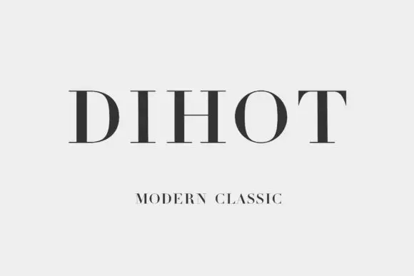
Broad classical capitals with strong vertical contrast and fine hairlines
Dihot is a broad classical capital alphabet with strong vertical contrast, hairline horizontals and fine unbracketed serifs, drawn for wide, formal settings.
Ideas for this font
Allow optional Google Analytics to measure visits and catalogue actions. Your search words and notes are not included. Privacy & storage