Modern Grotesque Body

Different Cultures + Saltriver Grotesk
Creates crisp high-hierarchy contrast beneath Different Cultures headlines across menus, websites and labels.
Inspect Saltriver Grotesk specimenDisclosure: MakerFileHub may earn a commission from qualifying purchases via paid links on this page. How our links work.
Heavy rounded mixed case with long curled entries and exits
Different Cultures shows white stacked words over a dark architectural photograph, where broad rounded bowls and heavy upright strokes meet a curled capital D and long curved terminals, with the t at the upper right sweeping below its line.
Paid link
Get this fontProject & layout blueprintsAt-a-glance maker compatibility
Sturdy stroke walls and open counters weed cleanly on adhesive vinyl, HTV apparel film, and cut cardstock.
Visual anatomy & craft review
The strokes stay heavy, the bowls round out, the terminals curl away and two lines interlock as the upper t drops into the space of the lower word. That interlock is the character: the pair reads as one composed block rather than two rows, which is why the cover is a spacing reference rather than an alphabet. Because the extensions travel, keep 24 mm between baselines from 30 pt and confirm the curl on the letters your own wording uses.
Heavy · Rounded · Curled entries
Two-font hierarchy recipes
Tested contrast partners — pairing Different Cultures with grounded secondary typography.
Different Cultures + Saltriver Grotesk
Creates crisp high-hierarchy contrast beneath Different Cultures headlines across menus, websites and labels.
Inspect Saltriver Grotesk specimen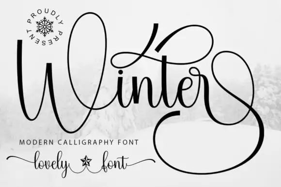
Different Cultures + Winter
Adds a warm human signature touch for 1-to-3-word callouts without competing against structured serif capitals.
Inspect Winter specimenPractical applications
Concrete hierarchy, scale and production guidance tailored to Different Cultures’s stroke geometry.
The heavy rounded serif sets a feature title, and the curled terminals hold a two-word heading at 46 pt over two interlocking rows on a page, where the pair reads as one block.
Hierarchy & layout recipe
Print a 210 mm page: set the two rows at 46 pt, keep 24 mm of clear ground between them so the t clears the row below, and keep 20 mm beneath before the standfirst at 10 pt.
Pre-production check
Long curls on tight leading collide with the row below; check the laid-out page at full size and open the gap to 26 mm.
The heavy rounded letters suit a venue label, and the broad bowls hold a short name at 22 pt on a 55 mm panel, where the curl stays inside the border.
Hierarchy & layout recipe
Print a 55 by 45 mm label: set the name at 22 pt on one row, keep 10 mm of clear ground beneath for the exit stroke, and set the street at 6 pt in a plain sans.
Pre-production check
A curled exit cut by the border looks broken; check the artwork and keep 8 mm of clear panel.
The heavy serif suits a warm invitation, and the rounded bowls hold two names at 28 pt on heavy card, where the curled D opens the row.
Hierarchy & layout recipe
Print a 105 by 148 mm card: set the names at 28 pt over two rows, keep 22 mm of clear ground between them, and set the date at 9 pt in a serif beneath.
Pre-production check
Two heavy rows with long curls need extra leading; check the card and keep 24 mm between baselines.
Technical & licence verification
Confirm included OTF/TTF/WOFF formats, full glyph tables and licence coverage on the live store page before batch production.
Closest visual alternatives
Matched across letterform anatomy, stroke behaviour and craft applications.

High-contrast display serif with sculpted curves and tucked swash legs
Orvelia is a high-contrast display serif in which the stems alternate thick and hairline weights, the R, V and A end in curved swash legs and the bowls stay sculpted, so a name reads as a crest for a perfume box or a masthead.
Ideas for this font
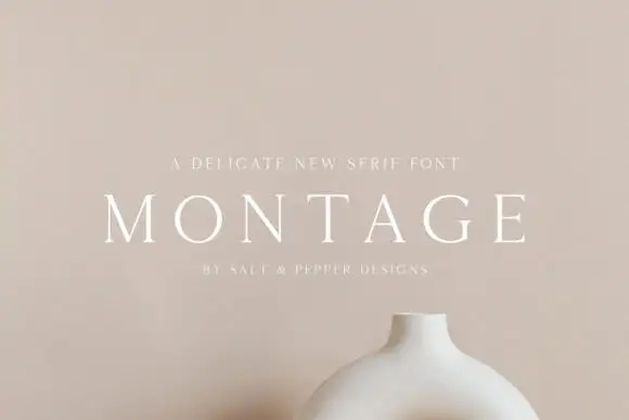
Delicate high-contrast serif
Montage is a delicate serif in white on a soft beige field: very fine hairlines, wide letterspacing, thin bracketed serifs and a high waist, set in caps on one line with a tracked line above and an attribution beneath, on a still life of a ceramic vessel.
Ideas for this font

Fine serif title with large upper and lower loops
Amilea shows pale yellow high-contrast letters with fine tapered serifs and broad rounded lowercase over a dark portrait, where a thin loop curves below the capital A and a tall upper flourish crosses the central ascender before sweeping right.
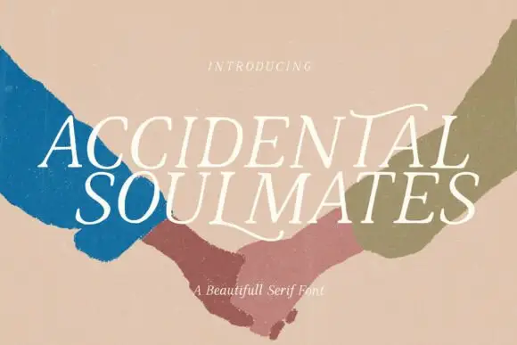
Slanted light capitals with fine serifs and selective curling extensions
Accidental Soulmates is a slanted light serif in which the capitals lean together, the serifs stay fine and two long extensions curl above the first row and sweep below the second, so a two-line title reads as a romantic editorial head.
Ideas for this font
Same independent foundry
Allow optional Google Analytics to measure visits and catalogue actions. Your search words and notes are not included. Privacy & storage