Editorial Serif Anchor

Butterheads + Orvelia
Anchors Butterheads's fluid strokes with crisp Roman proportions on wedding suites, headers and packaging.
Inspect Orvelia specimenDisclosure: MakerFileHub may earn a commission from qualifying purchases via paid links on this page. How our links work.
Bold slanted rounded script
Butterheads is a bold slanted script with round bowls and short ascenders, so a word reads as one heavy horizontal ribbon with a steady forward lean and closed-up interiors.
Paid link
Get this fontProject & layout blueprintsAt-a-glance maker compatibility
Weld or Unite overlapping script joins into one continuous vector path before sending to the blade.
Visual anatomy & craft review
The cover sets the single word in cream on a dark green panel, framed by two small dots, and the first thing the eye registers is how round it is: the B builds two nearly circular chambers, the o and e follow the same radius, and the double t is drawn with a short low crossbar so the two stems read as one run. Ascenders in the t and h barely clear the x-height, which flattens the word into a ribbon instead of letting it grow tall, and the lean is consistent across every letter so the baseline sits at a slight angle rather than the letters drifting. Weight is heavy and even, the joins are short and buried, and the interiors stay small. The feathered photograph inside the frame, the dots and the tracked caption at the foot are cover furniture rather than alphabet.
Bold · Slanted · Round
Two-font hierarchy recipes
Tested contrast partners — pairing Butterheads with grounded secondary typography.
Butterheads + Orvelia
Anchors Butterheads's fluid strokes with crisp Roman proportions on wedding suites, headers and packaging.
Inspect Orvelia specimen
Butterheads + Cenura
Keeps small-scale dates, URLs, nutrition facts and care instructions crisp and legible below script titles.
Inspect Cenura specimenPractical applications
Concrete hierarchy, scale and production guidance tailored to Butterheads’s stroke geometry.
A bold slanted ribbon of letters reads as an old-fashioned sweet label at small sizes, and the heavy round strokes stay solid on a curved tin where a fine script would thin out.
Hierarchy & layout recipe
Keep the name at 14 pt on a 70 mm label, set the weight and flavour in a tracked sans at 6 pt under the ribbon, and leave 5 mm clear at the right so the final s never wraps round the tin's curve.
Pre-production check
Round tins distort artwork at the edges; proof the label flat and then wrapped, because the tight e counter is the first detail to close.
The dense ribbon gives a recipe title the presence of a stamped label at the top of a page while leaving the method text to a plain face underneath it, which is the contrast the layout needs.
Hierarchy & layout recipe
Set the dish name at 40 pt across a single measure, run the introduction at 10 pt with 6 mm of space under the lowest letter, and keep the ingredient list in a tabular face so the numbers line up.
Pre-production check
At 40 pt the joins between letters soften into a shape; check that the two t stems still read as separate letters before approving the page.
Heavy round strokes weld into a single path well, so a short name can be cut as a topper and still be readable once it is a piece of card or acrylic standing above a cake.
Hierarchy & layout recipe
Scale the name to 70 mm wide on an 80 mm topper, keep every stroke at least 2 mm thick after scaling, and set the age in the same weight on the tag so the two pieces match at a glance.
Pre-production check
Cut a paper mock first: the tight space between the double t is where a blade will tear and leave a bridge of material.
Technical & licence verification
Confirm included OTF/TTF/WOFF formats, full glyph tables and licence coverage on the live store page before batch production.
Closest visual alternatives
Matched across letterform anatomy, stroke behaviour and craft applications.

Loose script with a looped capital and low tails across the baseline
Easy Handwriting is a loose script in which the capital loops high, the body stays low and the tails run flat along the baseline, so a phrase reads as something written quickly on a card rather than as calligraphy.
Ideas for this font
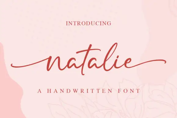
Thin low handwriting with long smooth tails and a gentle forward lean
Natalie is a thin handwriting script in which the letters stay low and small, the stroke never thickens and both ends of the word run out into long smooth tails.
Ideas for this font

Substantial handwriting script
Simple Handwriting is a substantial handwritten script in deep green on white: connected lowercase with open round bowls, a firm even stroke, tall ascenders and a long entry stroke on the H, set across two lines over a soft brush swipe, with a serif caption beneath and a studio credit at the foot.
Ideas for this font
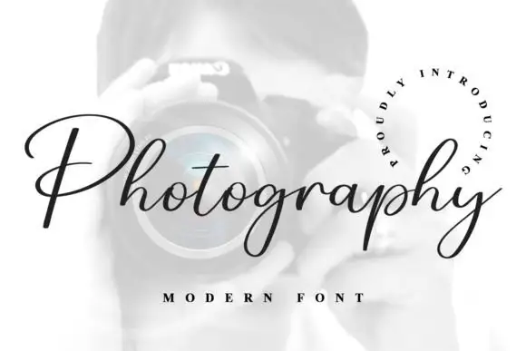
Fine connected script with a very open P
Photography is a fine slanted script in black on a pale photograph: a thin connected hand with a broad open P, hairline joins, a consistent slant and a curled tail on the y, framed by a circular line of tracked capitals.
Ideas for this font
Allow optional Google Analytics to measure visits and catalogue actions. Your search words and notes are not included. Privacy & storage