High-Contrast Display Serif

Ashenford Vintage Trio + Cronelo
Pairs sculptural editorial warmth with Ashenford Vintage Trio's clean modern geometry.
Inspect Cronelo specimenDisclosure: MakerFileHub may earn a commission from qualifying purchases via paid links on this page. How our links work.
Ornate vintage trio led by a swashed script with two supporting sans cuts
Ashenford Vintage is a three-part set in which an ornate swashed script leads, a condensed sans carries the small print and a high-contrast sans provides a second voice, so a vintage label can be built from one purchase.
Paid link
Get this fontProject & layout blueprintsAt-a-glance maker compatibility
Weld or Unite overlapping script joins into one continuous vector path before sending to the blade.
Visual anatomy & craft review
The script is the centre of the sample: a heavy connected hand with a looped capital A, a swash that runs under the word and a terminal that curls back at the end. The condensed sans is plain and narrow, tracked wide for small print. The high-contrast sans is lighter and wider, with a fine join between thick and thin strokes, which gives a third register without a serif. Used together they reproduce the layered look of a printed vintage label: script for the name, condensed for the details and the high-contrast cut for a claim or a date. The three hold at 10 pt, 7 pt and 8 pt on a label. The mint ground, the ornate frame, the red and green inks and the small captions are presentation; the bundle is the lettering.
Ornate · Vintage · Trio
Two-font hierarchy recipes
Tested contrast partners — pairing Ashenford Vintage Trio with grounded secondary typography.
Ashenford Vintage Trio + Cronelo
Pairs sculptural editorial warmth with Ashenford Vintage Trio's clean modern geometry.
Inspect Cronelo specimen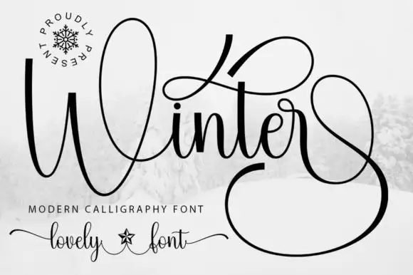
Ashenford Vintage Trio + Winter
Introduces organic movement on pull-quotes, signatures and gift tags.
Inspect Winter specimenPractical applications
Concrete hierarchy, scale and production guidance tailored to Ashenford Vintage Trio’s stroke geometry.
The trio covers a full label hierarchy from one set, so a small producer can build a layered vintage design without buying three families.
Hierarchy & layout recipe
Print a 90 by 60 mm label: set the brand in the script at 18 pt, the flavour in the high-contrast sans at 8 pt, and the weight in the condensed sans at 7 pt, keeping 5 mm of margin around the whole lockup.
Pre-production check
Three cuts on one small label crowd each other; check the proof at final size and drop the high-contrast line if the script needs more room.
The script carries the fascia name while the two sans cuts handle the hours and the claim, which is how a period shopfront is layered.
Hierarchy & layout recipe
Print a 900 by 400 mm panel: set the shop name in the script at 14 cm, set the hours in the condensed sans at 4 cm, and set the claim in the high-contrast sans at 5 cm, keeping 9 cm of border around the group.
Pre-production check
Small print on a large panel disappears at distance; check the sign from three metres and raise the condensed cut rather than the script.
The trio lets a cover title, a subtitle and an author credit sit in three registers that still read as one period design.
Hierarchy & layout recipe
Print an A5 cover: set the title in the script at 54 pt, set the subtitle in the high-contrast sans at 12 pt, and set the author in the condensed sans at 9 pt, holding 12 mm between the script and the subtitle.
Pre-production check
A script terminal can collide with a subtitle; check the cover at final size and move the subtitle down rather than shortening the swash.
Technical & licence verification
Confirm included OTF/TTF/WOFF formats, full glyph tables and licence coverage on the live store page before batch production.
Closest visual alternatives
Matched across letterform anatomy, stroke behaviour and craft applications.
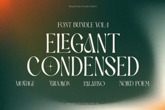
Fine condensed capitals with open bowls and narrow companion specimens
Elegant Condensed Bundle Vol Iv shows pale thin capitals across a green blurred field, where the central title combines narrow upright stems with broad open bowls and a small star sits inside one counter, while four smaller name specimens run along the lower area.
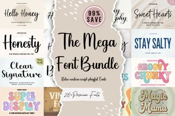
Twenty-plus scripts, serifs and displays
The Mega Font Bundle is a set of more than twenty faces: modern handwriting scripts, a clean signature, a wide comic serif, a chunky pastel display, a vintage label serif and a swashed script, presented as a grid of torn-paper tiles around a central card.
Ideas for this font
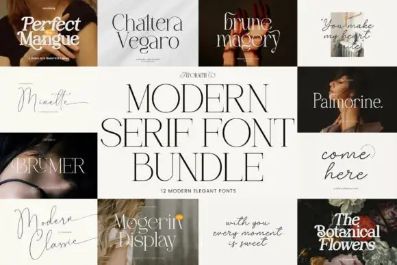
Twelve-cut modern serif bundle
Modern Bundle is a twelve-font serif bundle laid out as a grid of titled tiles: each of the twelve faces is shown in its own cover with its name set in itself, and the bundle name sits across a central cream panel in a high-contrast serif.
Ideas for this font
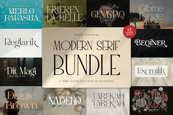
Fifteen-cut serif bundle
Modern Serif Style is a fifteen-font serif bundle shown as a wall of covers: each of the fifteen faces appears in a tile with its own name set in itself, ranging from thin didones to warm text serifs, with the bundle name centred over the grid on a cream panel.
Ideas for this font
Same independent foundry
Allow optional Google Analytics to measure visits and catalogue actions. Your search words and notes are not included. Privacy & storage



