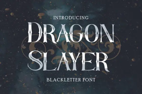
Thin tall capitals with irregular sharp joins and broad round bowls
Dragon Slayer
Dragon Slayer draws a blackletter very tall and thin, keeps the contrast between stems and joins high and ends the strokes in spikes, so the word reads as a row of blades rather than a medieval text face.
Ideas for this font